I spent my summer developing a look I will soon use in a narrative piece I nicknamed “50s French Film”. The key characteristics of the look are a monochromatic presentation and a classic cinemascope aspect ratio of 2.55:1. I was inspired by various French films of the 1950s that were shot in black and white that usually had a rather low contrast look. While many films of the 50s had a low-contrast look, due to the high-key classical lighting that was almost always employed at the time, French monochromatic films of this era seem to have even lower contrast. I credit this mostly to shooting outdoors, using the sun and many reflectors/lights that roughly match the brightness of the sun to fill in shadows. The most referenced visual inspiration for me was Jacques Tati’s ‘Les Vacances de Monsieur Hulot’. So front lighting with the sun, using reflectors and mirrors to fill in shadows when lighting subjects, would be the key direction to move in when lighting in this style.
My first action in conceiving this look was to create a realistic and accurate emulation of the Kodak film stock ‘Eastman Double-X Black & White Negative Film 5222’. While this stock was created in 1959, and I was developing a look that was slightly earlier and visually more classical, I prefer the characteristics of this stock.
One of the main characteristics of this stock is the thicker grain in the midtones, which was easy enough to recreate in DaVinci Resolve. I already had an accurate grain recreation of Kodak’s ‘2383’ stock; so all I did was alter where that grain is most prominent. All this included was raising the grain in the midtones by 25%. I also needed to recreate the colour response of the film: how it registers the luminosity of different colours. I could find this through the technical information of the stock on the Kodak website. I then recreated this using the ‘Hue Vs Lum’ window in Resolve. Additionally, I added a warm tint to the highlights of the frame to emulate the use of an incandescent lightbulb when projecting the stock (though this is optional, I will most likely not use it for the final look).

Now that I had an accurate grade of the film stock, I needed to consider other technical aspects of the time that would have influenced and altered the aesthetics of the image. The most prominent being anamorphic lenses. The anamorphic lenses of the time were filled with many imperfections, as the technology was very new and they didn’t have computers to help build them. Often focus would fall off towards the edges of the frame and flaring was much more common than in modern lenses.
First, I tried recreating the focus fall-off. I began by using the lens blur effect in Resolve and masking it to only appear around the edges of the frame. This proved not to work well, as the mask simply reveaed the blur effect, only affecting the transparency of the node, not the intensity.

I needed to find a way to create a progressive lens blur effect. So I turned to the tilt-shift effect in Resolve. This created a progressive blur effect. However, I did not want it to only affect the parallel edges of the frame, I wanted it to use the shape of the mask I had created. So, instead of using the built-in mask, I used the input of the mask I had created in a different node on the tilt-shift effect node. Thus creating a progressive lens blur effect that I could mask into any shape I wanted.
While this focus fall-off effect looks very convincing and natural, any time I would use it with a slightly shallower depth of field the illusion would shatter as a mixture of anamorphic blur and spherical blur could be seen, as I was shooting with a spherical lens after all. I knew that creating a depth map and digitally blurring the background using an anamorphic lens blur effect would be too time-consuming and, at times, borderline impossible. Even if it were successful, it most likely would not look convincing. So I needed a way to achieve an anamorphic blur look practically.
My mind went to a shot in the Bourne Supremacy (Greengrass, 2004) that was captured using a very long lens, allowing them to close the matte box more than they would on a wider lens. This affected the shape of the bokeh in the background, cutting off the tops and bottoms of each one, almost pill-shaped. This made me think, what if I placed a piece of card behind the lens and cut out an oval shape, shaping all light that passed through the lens into an oval shape? I tried it, and it worked perfectly; creating a convincing anamorphic bokeh effect. I lost about one stop of exposure, but that wasn’t much of a concern.
Other characteristics are the types of flares that would occur with the old anamorphic lenses. First, I decided to try a method Chayse Irvin used on ‘Blonde’ (Dominik, 2022) in which he placed a piece of fibre optic audio cabling behind the lens. Placing it vertically causes the light to hit the wire and scatter horizontally across the frame. This evokes the feeling of an anamorphic lens while attaining a more unique look; the creation of a flare that looked neither spherical nor anamorphic, something new. I too placed a wire of sorts behind the lens; for me, though, it was a piece of transparent rubber string I found in some old craft supplies. It created a unique flare that I really liked the look of. It didn’t look like the type of flare that would occur on an old Panavision lens, but I thought it was a really nice effect that I wanted to use; after all, I wasn’t trying to create a carbon copy of the classical style, just emulate it.
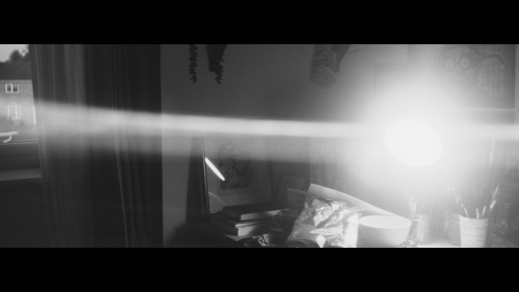
I really Like the way the flare splinters out from the centre of the light source. It’s not accurate to the Panavision C Series anamorphic lenses I’m basing my recreation on, but it’s an appealing look nonetheless.
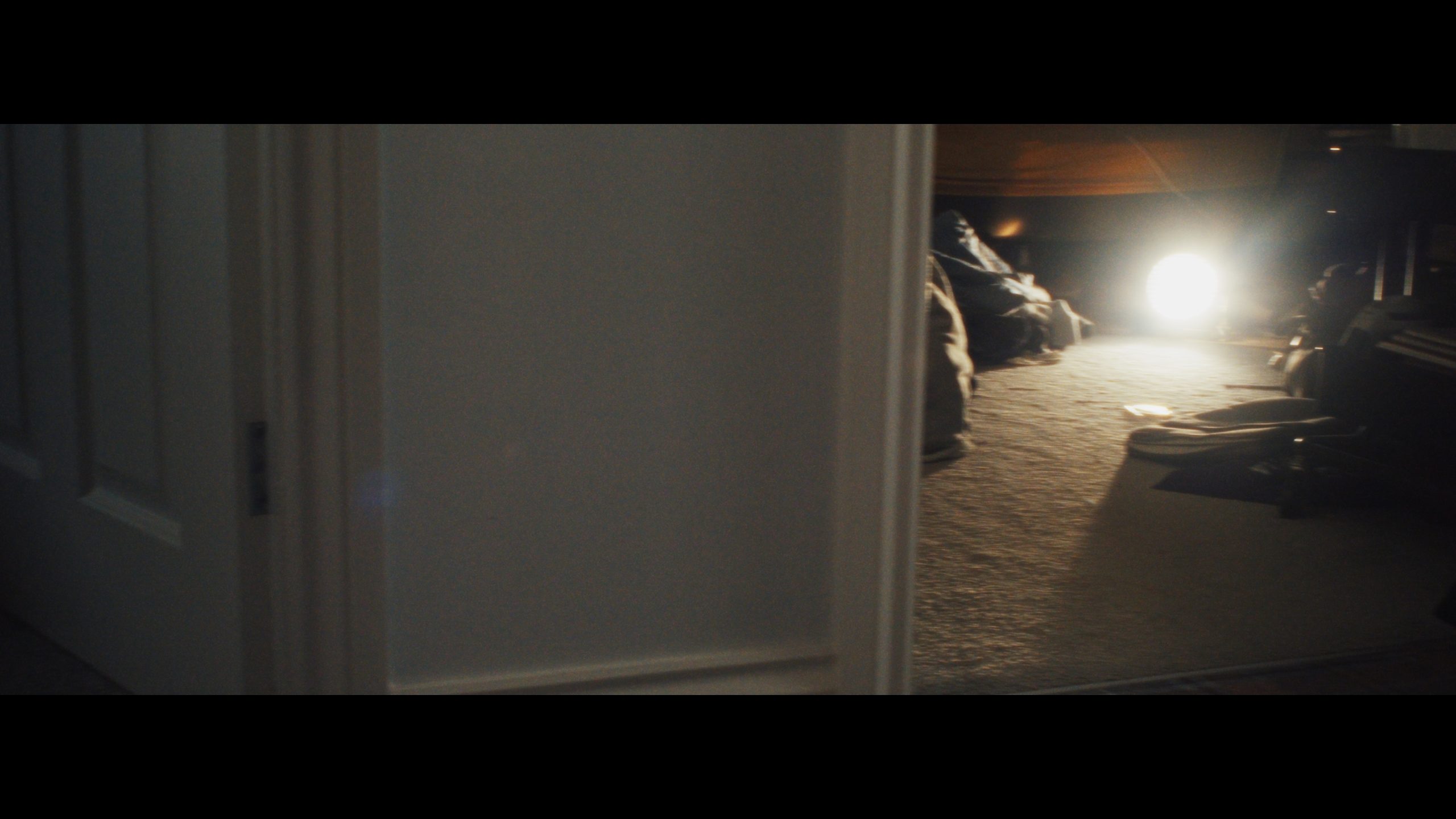
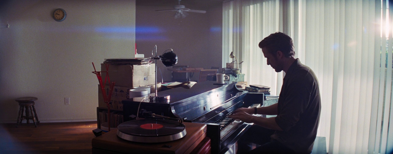
Another aspect of flaring I liked was how the corners of the lenses would reveal themselves when light would bounce off of them. Like in this example from ‘La La Land’ (Chazelle, 2016) below.
I knew this was something I would need to create digitally, as this did not happen naturally with my Canon FD lenses; even if it did, it would not align with the corners of the 2.55:1 aspect ratio I was letterboxing onto the frame. My resolution to this was the lens reflections effect in Resolve. I set the reflections to spread as far as they could, masking them only to the corners of the frame. This way, when a light source was in one corner of the frame, the opposite corner would illuminate. See examples below.
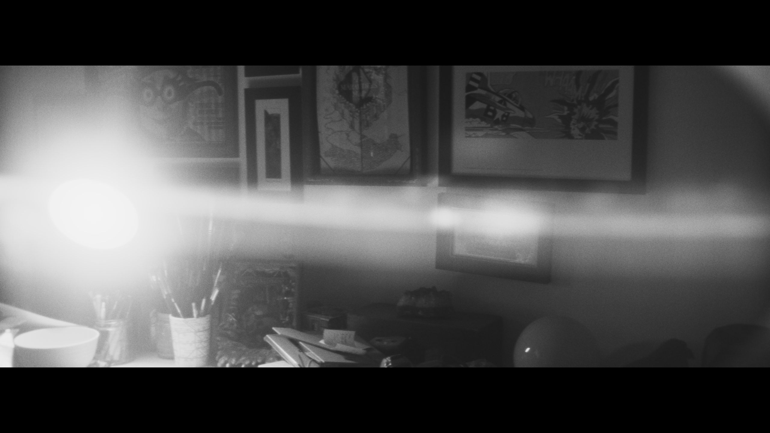
I also recreated another type of edge reflection. Where highlights flare and bloom when they pass the edges of the frame. It’s a subtle effect, but one that adds to the authenticity of the look. See the example below.
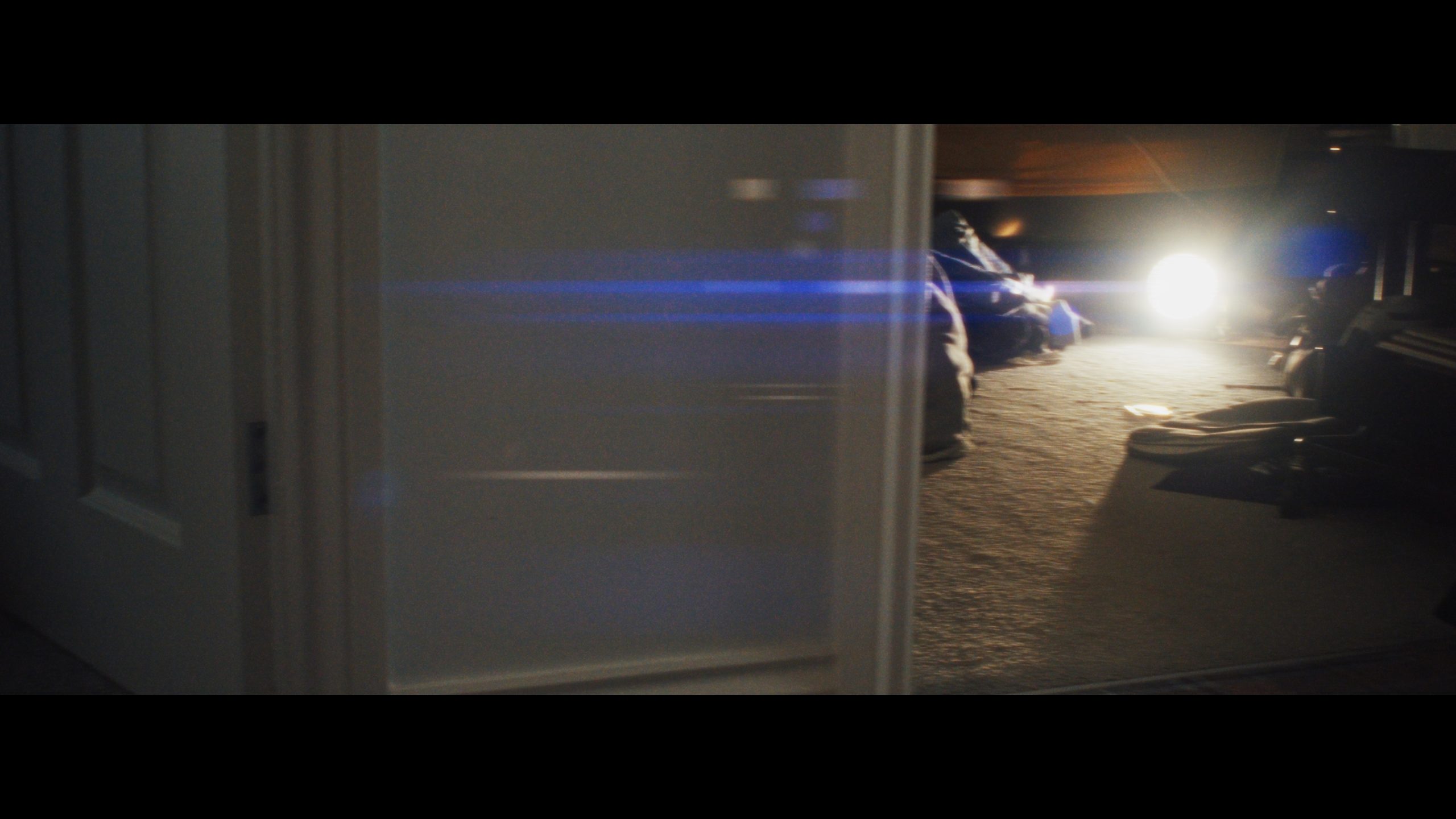
For the final aspect of the look, I wanted to recreate, as closely as I could, the flaring of the Panavision lenses used on West Side Story. These are possibly my favourite lenses to ever exist, so I spent many hours approximately matching the flares from those lenses.
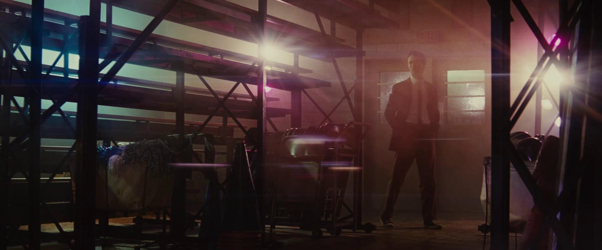
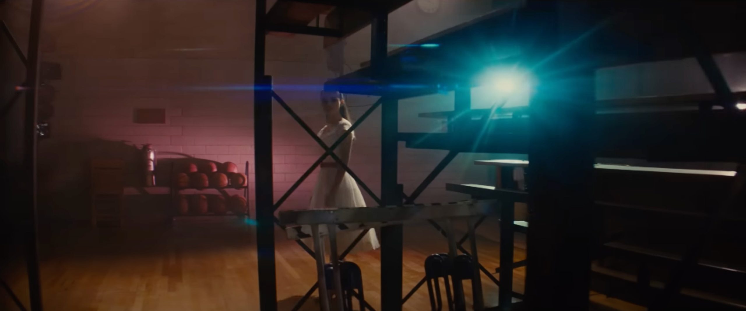
I opted to again use the lens reflection effect in Davinci Resolve. The brightness of the light source that was flaring would affect whether the flare was coloured blue or not. I also made more specific reflections of the light source on the ‘lens’ that were closer to the source in the frame. This digital effect can be used either interchanged or in combination with the practical wire flare effect. The final result can be seen in the examples below (including a before and after). It’s not a perfect match, but it’s the closest I could get without using the actual Panavision lenses.